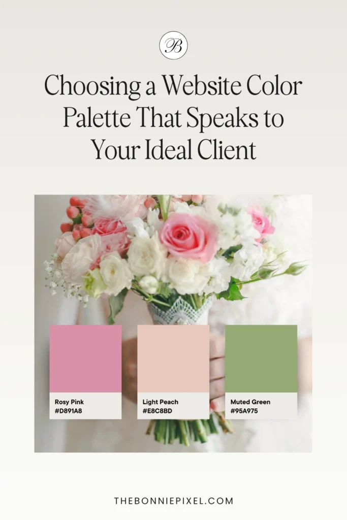
The wedding industry is built on emotion, vision, and deeply personal connection. As a wedding professional, your website color palette is one of the most powerful and often underestimated tools you have to forge that initial connection with your ideal client.
It’s more than just aesthetics; it’s a silent language that communicates your brand’s personality, your service level, and the very feeling of the wedding experience you offer.
Are you inadvertently sending the wrong signal with a generic color scheme? In a sea of bridal businesses, your chosen hues are what set you apart.
This comprehensive guide will walk you through the psychology, strategy, and practical steps to selecting a website color palette that not only looks beautiful but also converts browsers into booked clients.
The Silent Language: Color Psychology in Wedding Branding
Color psychology is the study of how colors influence human behavior and decision-making. For a service as emotional as wedding planning, photography, or floral design, the colors on your website homepage, portfolio, and branding materials can immediately trigger an emotional response in a potential client. Your website color palette acts as an emotional shortcut.
Understanding this dynamic is crucial for every wedding professional looking to refine their brand identity.
A. Decoding Key Colors For Your Website
Different hues evoke specific feelings that directly relate to the wedding experience. Here is a breakdown of common color meanings, vital for crafting a perfect color combination:
- Red (Burgundy, Crimson): Signifies passion, romance, and energy. Ideal for brands focusing on bold, dramatic, or high-energy celebrations. Too much bright red can signal alarm or urgency, but you could choose deep, rich shades like burgundy to give a more sophisticated impression.
- Blue (Navy, Sky Blue): Represents trust, serenity, stability, and loyalty. This is a powerful color for services that require a high degree of confidence, such as a full-service wedding planner or a photographer focused on heirloom quality. Navy suggests formality and elegance.
- Green (Sage, Emerald): Symbolizes nature, growth, harmony, and renewal. Excellent for professionals specializing in outdoor, eco-friendly, or organic-style weddings. Emerald and deep forest greens also hint at wealth and sophistication.
- Purple (Lavender, Plum): Historically associated with royalty, luxury, and creativity. Darker shades convey opulence and drama, perfect for luxury wedding planners. Lighter shades, like lavender, suggest romance and whimsy.
- Yellow (Gold, Mustard): Evokes joy, optimism, and warmth. Great for fun, celebratory, or bohemian-style wedding vendors. Gold, a sophisticated metallic variation, immediately signals premium service and glamour, making it a favorite for high-end color schemes.
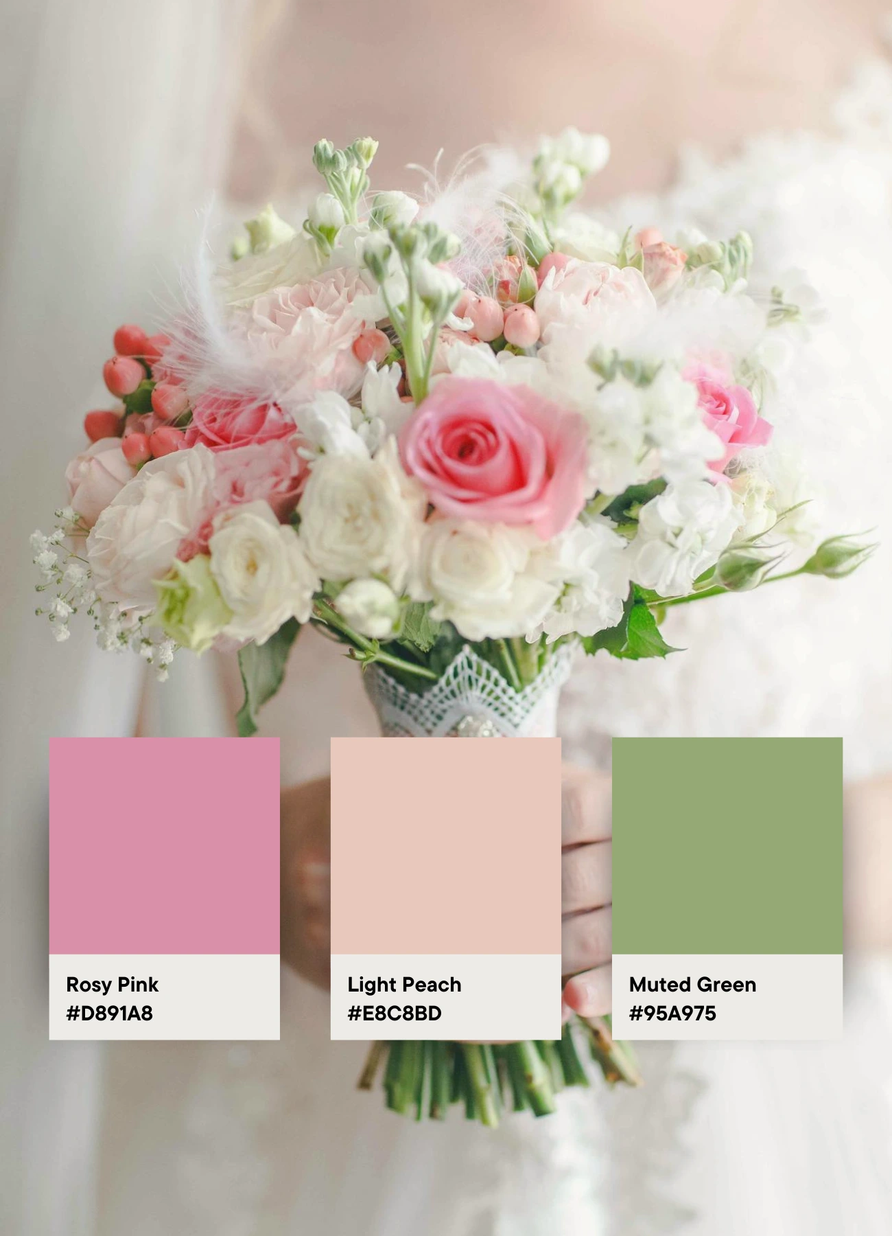
- Pink (Blush, Rose): The quintessential color of romance, femininity, and sweetness. Blush is a universal favorite in the wedding world, conveying soft, sentimental elegance. Deeper rose or fuchsia suggests a more modern, playful, or fashion-forward approach.
- Neutrals (Black, White, Gray, Beige): The foundation of a timeless aesthetic. White suggests purity, simplicity, and a blank canvas for the couple’s vision. Black conveys drama, sophistication, and modernity. Grey is balanced and elegant. Using a base of neutrals allows your beautiful portfolio photography to take center stage.
B. The Impact of Your Chosen Tones
The shade matters as much as the color itself. A vibrant, high-saturation color palette suggests a lively, energetic, and modern brand, while a muted, low-saturation color combination communicates softness, vintage romance, and subtlety. Make sure the tone reflects the style of wedding you want to book.
Aligning Your Color Palette with Your Wedding Niche
Your color palette must be a reflection of your specific brand niche and the client you are trying to attract. A rustic barn wedding florist and a glamorous ballroom DJ should have vastly different visual identities. Here are some examples:
1. The Luxury Wedding Planner
- Ideal Color Scheme: Dominated by deep neutrals and metallics. Think Charcoal Grey, Creamy Ivory, and opulent Gold or Rose Gold accents. A single, rich jewel tone like deep Emerald Green or Sapphire Blue can be used sparingly for sophistication and contrast.
- Why it Works: This color combination instantly signals high-end, bespoke service. The neutrals are timeless and elegant, allowing the focus to remain on the quality of your work and the implied prestige.
2. The Destination or Adventure Photographer
- Ideal Color Scheme: Focus on colors found in nature and travel. Deep Navy, Muted Teal, Earthy Khaki, and a touch of a warm color like Burnt Orange or Rust.
- Why it Works: These colors evoke a sense of grounding, exploration, and natural beauty. The subtle warmth prevents the palette from feeling too cold or distant, appealing to adventurous couples who value experiences over formality.
3. The Modern, Fashion-Forward Florist/Designer
- Ideal Color Scheme: Embrace bold contrast and current trends. A crisp Black and White base with a vibrant pop of color—such as Electric Fuchsia, Mustard Yellow, or even the trendy use of a high-impact Red.
- Why it Works: This approach is sharp, clean, and memorable. It communicates that your brand is on the cutting edge of design and not afraid to take risks, attracting couples who prioritize style and a strong visual aesthetic.
4. The Classic, Romantic Venue or Caterer
- Ideal Color Scheme: Soft, timeless, and approachable. A base of Cream or Pale Gray with gentle accents like Blush Pink, Dusty Blue, and soft Sage Green.
- Why it Works: This color palette is universally appealing and evokes feelings of traditional romance, safety, and elegance—all things a couple seeks in a reliable venue or vendor.
A Step-by-Step Guide to Building Your Color Combination
Choosing your final, cohesive website color palette should be a structured process, not a guess. Follow the 60-30-10 Rule to ensure balance and professional polish in your website design.
Step 1: Define Your Primary Color (60%)
This is the main color that will dominate your website, appearing in large blocks like backgrounds, headers, and major structural elements. It should be the color that most strongly represents the core emotion and quality of your brand.
- Action: Choose one color that aligns with your niche (e.g., Creamy Ivory for luxury, soft sage Green for rustic).
Step 2: Select Your Secondary Color (30%)
Your secondary color provides contrast and depth. It will be used for subheadings, sections, complementary graphics, and larger blocks of design elements. This color should complement your primary color without competing with it. Referencing the color wheel (analogous or complementary colors) can be helpful here.
- Action: Select a color that provides visual interest and supports your primary color (e.g., Deep Navy to complement Creamy Ivory).
Step 3: Identify Your Accent Color (10%)
The accent color is the strategic pop. It must be a high-impact color used for the most important, conversion-focused elements: Call-to-Action (CTA) buttons, important links, and small icon highlights. Its scarcity ensures that when it appears, it commands attention.
- Action: Choose a color with high contrast to your primary and secondary colors
Pro Tip: Never use your accent color for large blocks of text or background. Reserve it only for elements you want the client to click or notice immediately.
Practical Implementation and Consistency
Once you have your core website color palette defined by the 60-30-10 rule, the work isn’t over. Consistency is key to building a memorable and trustworthy brand.
1. Get Technical: Hex Codes and Accessibility
Translate your chosen colors into specific digital codes, typically Hex Codes (e.g., #FFFFFF for white, #A9A9A9 for dark gray). Use a color picker tool to get the exact codes and document them in a brand style guide. This ensures that the shade of pink your website designer uses is the exact same shade of pink on your social media templates and printed welcome guide.
- Crucial Note: Always check your color combination for accessibility. Ensure sufficient contrast between your text color and background color so that all users, including those with visual impairments, can easily read your content.
2. The Power of a Neutral Background for Photography
While your color palette is essential, remember that for a wedding professional, the star of the show is your portfolio.
A well-chosen color scheme should complement, not clash with, your images. Using neutral colors from your palette on portfolio pages in particular ensures that your vibrant floral arrangements, stunning venue shots, and colorful client photographs always look their best and remain the primary visual focus. This keeps the client engaged with the proof of your skill.
3. Total Brand Consistency
Your website color palette is your digital calling card, but your brand extends beyond your URL. For a professional, high-end look, you must apply the same color combination consistently across all client touchpoints:
- Social Media: Templates, highlight covers, and profile imagery.
- Client Documents: Welcome guides, pricing PDFs, contracts, and invoices.
- Print Materials: Business cards, stationery, and brochures.
This meticulous use of your color scheme reinforces your brand, makes you look organized, and builds trust—all essential factors in securing premium wedding bookings.
Conclusion: Your Palette is Your Promise
For wedding professionals, your website color palette is an investment in your brand’s future. It’s the visual handshake that precedes the personal consultation.
By moving past generic templates and thoughtfully selecting a color combination rooted in psychology and niche relevance, you are making a deliberate choice to attract and resonate with your ideal client.
Your brand’s aesthetic promise—whether it’s timeless elegance, adventurous spirit, or modern drama—is communicated through the hues you choose. Take the time to audit your current color scheme, compare it against the emotional signals you want to send, and make the strategic shifts necessary to ensure your online presence is a high-converting, unforgettable reflection of the beautiful work you do.
FAQ
1. What is the best website color palette for wedding professionals?
The best website color palette for wedding professionals uses soft neutrals, muted pastels, or elegant metallics that reflect sophistication and romance. Choose 2–4 complementary hues that align with your brand style and attract your ideal wedding clients — whether they’re classic, modern, or luxury-focused.
2. How do I choose brand colors that attract my ideal clients?
Start by defining your ideal client’s style and emotions — think of the mood you want your brand to evoke. Use warm neutrals, soft golds, or timeless tones to create a sense of refinement. Luxury clients are drawn to understated elegance, clean design, and cohesive color harmony across your website and branding.
3. Why does a website color palette matter for wedding professionals?
Your website’s color palette shapes how potential clients feel about your brand within seconds. The right colors build trust, communicate your professionalism, and attract the type of couples you want to book. A cohesive palette ensures your website looks polished and aligned with your overall wedding brand identity.
4. How many colors should a wedding professional use on their website?
Most wedding professionals should use three to five core colors — a primary color, one or two secondary colors, and an accent. This balance keeps your design cohesive and visually appealing while allowing key elements like call-to-action buttons to stand out.
5. What are common color palette mistakes on wedding websites?
Common mistakes include using too many colors, choosing shades with poor contrast, or selecting trendy hues that don’t fit your brand. Avoid mixing cool and warm tones randomly — instead, choose colors that reflect your aesthetic and your ideal client’s taste, ensuring your site feels intentional and high-end.
6. How does the color of my Call-to-Action (CTA) button affect bookings?
The color of your Call-to-Action (CTA) button is crucial because it must achieve high visibility and contrast to drive bookings. Your CTA button should use your Accent Color (the 10%) because this color is used sparingly and signals immediate importance.
An effective CTA color:
- Has high contrast against the button background (e.g., gold button on a navy section).
- Is consistently the same color across the entire website, training the user’s eye where to click for conversion.
7. Which colors attract high-end wedding clients?
If your ideal clients are those looking for a luxury experience, your color scheme should emphasize sophistication, depth, and timelessness. The most effective color combinations include:
- Rich Neutrals: Cream, Ivory, and Deep Charcoal or Navy Blue. These are associated with formality and bespoke quality.
- Metallics: Use subtle Matte Gold, Brushed Brass, or Rose Gold as the accent color (the 10%). Avoid overly bright or shiny yellow-gold, which can appear less refined.
- Jewel Tones (Used Sparingly): Deep Emerald Green, Sapphire Blue, or Rich Burgundy add an element of opulent drama and wealth when paired with a neutral base.

Jan Small is a web and graphic designer and owner of The Bonnie Pixel Design Co which offers all kinds of designs tailored for busy wedding professionals. Jan lives in Scotland with hubby and fur baby cockapoo Alfie and loves writing, yoga, and chocolate.
Leave a comment