
When visitors land on your website, you have only a few seconds to capture their attention and guide them toward taking action. Whether you want them to book a consultation, explore your services, or join your email list, the words you use matter. That is where an effective call to action (CTA) comes in.
In this article, we will break down what makes a CTA effective, share real-world examples (including those tailored to a wedding planner website and a wedding photographer website), explore the best places to use them, and show you how to optimize for better results. By the end, you will walk away with ready-to-use phrases and a clear strategy to turn more clicks into bookings.
What Makes a CTA Effective?
An effective call to action is more than a button that says “Click Here.” It is a phrase that motivates your visitor to take the next step in their journey with you.
Here are the psychological triggers behind strong CTAs:
- Urgency and scarcity: Words like “today,” “now,” and “limited” encourage people to act before they lose their chance.
- Clarity: Vague CTAs confuse. Specific CTAs convert.
- Benefit-driven language: Visitors need to know what they will gain. For example, “Get Your Free Checklist” tells them exactly what is in it for them.
- Personalization: Using words like “your” instead of “the” makes the action feel tailored to them.
Studies show that improving CTA copy can increase conversions by over 100%. Even small tweaks, like changing “Submit” to “Get My Free Quote,” can have a big impact.
Core Principles of Effective Call to Action Phrases
The foundations of high-converting CTAs are not difficult to grasp as long as you’re aware of them!
1. Clarity Over Cleverness
A clever phrase might sound nice, but if the visitor is unsure what will happen next, they won’t click.
Example:
- Clear: “Download Your Free Wedding Timeline”
- Vague: “Unwrap the Magic”
2. Use Strong Action Verbs
CTAs work best when they start with a verb that communicates exactly what the visitor should do.
Examples include: Book, Download, Reserve, Save, Join, Discover, Start.
3. Make It Personal
Small word choices make a difference. “Start your journey” feels more direct than “Start the journey.”
4. Reduce Friction
Avoid creating extra barriers. If your form is long, people will hesitate. Keep it short and pair it with a reassuring CTA like “Takes Only 2 Minutes.”
Examples of High-Converting CTA Phrases (General Use)
Here are general CTA phrases that work across industries, with an explanation of why they convert.
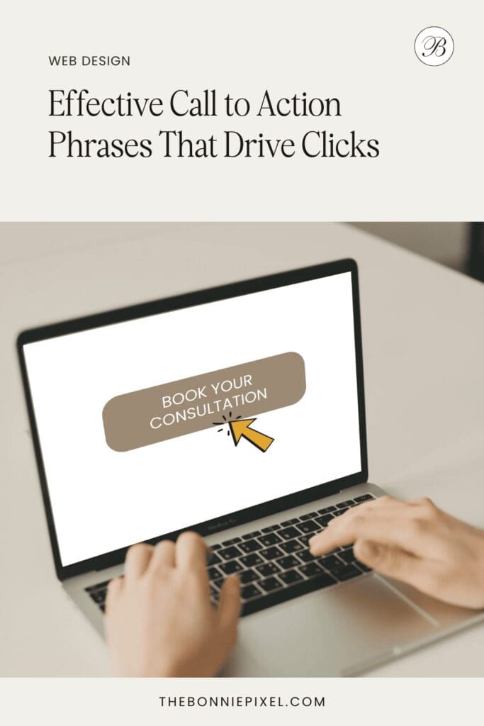
- “Book Your Free Consultation Today” – Combines urgency with the benefit of free value.
- “Get Instant Access” – Suggests speed and convenience.
- “Start Your Journey Now” – Inspires action with forward momentum.
- “Claim Your Free Guide” – Emphasizes ownership and value.
- “Let’s Start Planning” – Creates a collaborative feeling.
- “See Pricing and Packages” – Transparent and removes uncertainty.
- “Check Availability” – Perfect for service-based businesses where scheduling matters.
Tip: The most effective calls to action balance emotion with practicality. They tap into your visitor’s desire while giving them a clear next step.
CTAs for Wedding Planner Websites
A wedding planner website should encourage visitors to connect emotionally while making it easy to book a service. Couples visiting your site are often overwhelmed, so your CTAs should feel inviting, reassuring, and confidence-building.
Effective Wedding Planner CTA Examples:
- “Save Your Wedding Date” – Direct and action-focused.
- “Let’s Design Your Dream Day” – Emotional and aspirational.
- “Schedule Your Free Timeline Review” – Adds tangible value.
- “Book a Consultation Call” – Straightforward and professional.
- “Download Your Free Wedding Budget Template” – Lead-generation friendly.
- “Discover How We Can Make Your Day Stress-Free” – Benefit-driven.
- “Start Planning With Us Today” – Collaborative tone.
Best Placement for Wedding Planner CTAs
- Above the fold on the homepage: “Let’s Start Planning.”
- On service pages: “Schedule Your Free Timeline Review.”
- On blog posts: “Download Your Free Wedding Checklist.”
- On the contact page: “Save Your Wedding Date.”
CTAs for Wedding Photographer Websites
A wedding photographer’s website has the added power of visuals. Visitors are often drawn in by beautiful galleries, but an effective call to action ensures that interest turns into a booking.
Effective Wedding Photographer CTA Examples:
- “Check My Availability” – Encourages immediate action.
- “See My Wedding Portfolio” – Directs users to key proof of skill.
- “Reserve Your Spot for 2026 Weddings” – Creates urgency with limited availability.
- “Download My Wedding Shot List” – Provides value while showcasing expertise.
- “Let’s Capture Your Story” – Emotional and personal.
- “Book Your Engagement Session” – Encourages smaller commitments first.
- “View Pricing and Packages” – Builds trust with transparency.
Best Placement for Wedding Photographer CTAs
- On gallery pages: “Let’s Capture Your Story”
- On investment/pricing pages: “Reserve Your Spot for 2026 Weddings.”
- On inquiry forms: “Check My Availability.”
- On blog posts or resources: “Download My Wedding Shot List.”
Where to Place CTAs on Your Website
Even the best CTA phrases won’t work if they are hidden. Placement matters just as much as the wording.
High-Impact CTA Locations
- Hero section (top of homepage): The first place people look.
- Service pages: Guide visitors toward booking or contacting you.
- Blog posts: Pair helpful content with a relevant download.
- Footer: A subtle reminder on every page.
- Pop-ups or slide-ins: Used sparingly, these can capture attention without being intrusive.
Rule of thumb: Most pages should have one primary CTA and one secondary CTA for balance.
How this works:
One primary CTA per page: Each page should have a main goal (e.g., book a call, check availability, download a guide). Having one clear action keeps visitors focused and avoids “choice overload.”
One secondary CTA: A softer or alternative action for people who aren’t ready to commit yet. For example, on a wedding planner homepage:
Primary CTA: “Book Your Free Consultation”
Secondary CTA: “Download Your Free Wedding Budget Template”
This way, you catch both the hot leads (ready to book) and the warm leads (interested but not yet ready).
The only nuance may be for long-form pages (like blog posts or detailed service pages), where you may repeat the same primary CTA multiple times throughout the page. That’s still consistent with the “one primary, one secondary” rule. You’re just making sure it’s visible wherever the reader is.
Common CTA Mistakes to Avoid
Even experienced business owners fall into these traps:
- Being vague: “Click Here” or “Submit” does not inspire action.
- Overloading with too many CTAs: More options often lead to decision paralysis.
- Using the same CTA everywhere: Variety keeps visitors engaged.
- Lack of visual contrast: CTAs should stand out with design and color.
- Forgetting mobile users: Buttons must be easy to tap on smaller screens.
Testing and Optimizing CTAs
The most effective calls to action evolve through testing. What works for one website may not work for another.
How to Optimize:
- A/B test phrasing: Compare “Book a Free Consultation” with “Schedule Your Free Planning Call.”
- Experiment with design: Button color, size, and placement all affect clicks.
- Use analytics: Track click-through rates to see what resonates.
- Adopt an iteration mindset: Review results regularly and make small, consistent improvements.
Conclusion
An effective call to action is not just a button. It is the bridge between interest and action, between a website visitor and a paying client. Whether you run a wedding planner website, a wedding photographer website, or any other creative business, your CTAs should be clear, benefit-driven, and strategically placed.
Now is the time to audit your own website or contact us to audit it for you. Are your CTAs vague, hidden, or uninspiring? Or are they encouraging clicks, conversations, and bookings?
Start transforming your website clicks into bookings with the proven CTA phrases above and see bookings increase.

Jan Small is a web and graphic designer and owner of The Bonnie Pixel Design Co which offers all kinds of designs tailored for busy wedding professionals. Jan lives in Scotland with hubby and fur baby cockapoo Alfie and loves writing, yoga, and chocolate.
Leave a comment