
Your website is often the very first impression couples get of your wedding planning business. Before they send an inquiry or book a consultation, they’ll spend time browsing your site. They are looking at your work, learning about your services, and deciding whether they feel confident putting one of the most important days of their lives in your hands.
That’s why your wedding planner website is so much more than an online brochure. It’s your digital storefront and one of your most powerful marketing tools.
But too many talented wedding planners unintentionally lose inquiries because of avoidable website mistakes. From weak visuals to missing calls-to-action, these issues can quietly undermine your efforts and leave potential clients moving on to a competitor whose website feels clearer, more polished, and more trustworthy.
Don’t worry though, because once you know what to look for, these common website mistakes are simple to fix. Below, we’ll explore five of the most frequent problems wedding planners face and share practical website design ideas you can use to turn your site into a client-attracting machine.
Mistake 1: Weak First Impression
Couples make snap judgments. Research shows visitors form an opinion about your website within 0.05 seconds. That means if your homepage feels outdated, cluttered, or inconsistent with your brand, you risk losing their trust before they even see your portfolio.
What Weakens a First Impression?
- Outdated design for example, tiny text, clashing colors, or boring grids.
- Cluttered layouts where too much information fights for attention.
- Low-quality images that don’t do your work justice.
- Generic templates that don’t reflect your unique brand personality.
For a wedding planner website, aesthetics matter even more. Couples are hiring you for your taste, organizational skills, and ability to create beauty. If your site doesn’t communicate elegance and professionalism, they may assume your services won’t either.
How to Avoid Mistake 1: Website Design Ideas
- Invest in strong visuals: Use high-resolution photos from real weddings. Replace stock imagery with authentic galleries wherever possible.
- Keep it clean: White space is your friend. Avoid clutter and let your imagery and words breathe.
- Stay consistent: Use a limited color palette and two to three complementary fonts to create cohesion.
- Show personality: From your logo to your wording, make sure your brand’s voice shines through.
Ask yourself: If a dream client landed on my homepage today, would they instantly feel they’ve found someone who understands their vision?
Mistake 2: No Clear Call-to-Action
Even beautifully designed websites fail if they don’t guide visitors to take the next step. Many websites bury their contact forms, use vague wording like “Learn More,” or have no obvious path to booking a consultation.
Without a clear call-to-action (CTA), couples may leave feeling uncertain about what to do next.
Why Calls-to-Action Matter
- They give couples direction at every stage of their browsing.
- They reduce friction and make it easy to inquire when excitement is high.
- They position you as confident and professional, ready to guide the process.
How to Avoid Mistake 2: Smart CTA Strategies
- Highlight your main CTA: Buttons like “Inquire Now” or “Schedule Your Consultation” should appear above the fold (visible without scrolling).
- Repeat strategically: Add CTAs at the bottom of every service page, blog post, and portfolio section.
- Make them stand out: Use a contrasting color and bold text so buttons are easy to find.
- Simplify your forms: Don’t overwhelm couples with 20 questions. Ask for only the essentials to start the conversation.
Think of your CTAs as breadcrumbs—subtle but clear signs leading couples from browsing to booking.
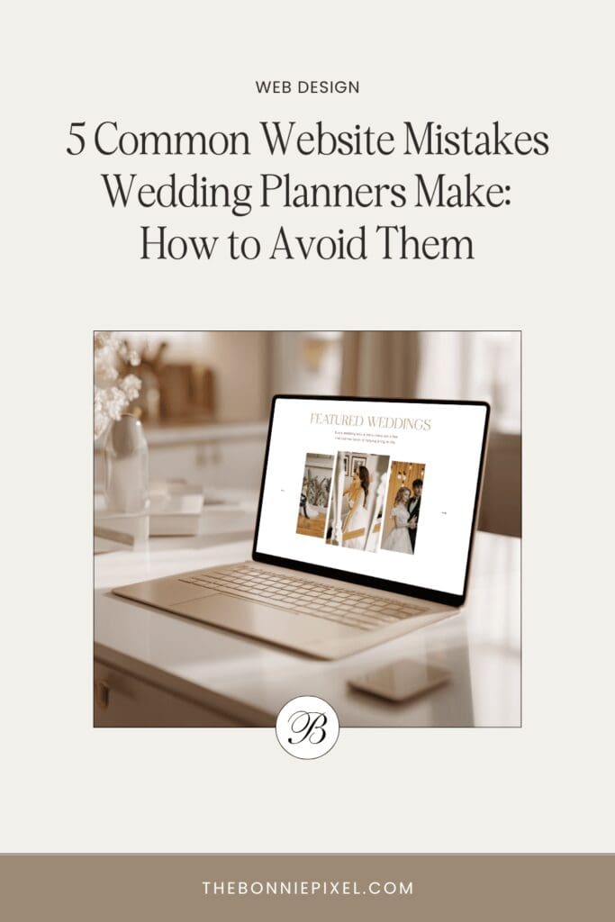
Mistake 3: Poor Portfolio Presentation
Your portfolio is the heart of your website. Couples want to see the magic you’ve created for past clients. Yet one of the most common website mistakes is presenting work in a way that feels either overwhelming or underwhelming.
Portfolio Mistakes to Avoid
- Low-quality images that are pixelated, dark, or awkwardly cropped.
- Disorganized galleries with no clear categories or storytelling flow.
- Too much or too little: Dozens of random images with no context, or just one or two weddings that don’t showcase variety.
- No storytelling: Simply dumping images without captions, context, or explanation of your role.
How to Avoid Mistake 3: Portfolio Design Ideas
- Curate, don’t clutter: Showcase only your best weddings, ideally 5–10 complete galleries that represent your style.
- Tell the story: Use captions to explain the couple’s vision and how you brought it to life. Mention your planning role so visitors know what you contributed.
- Organize by theme: Group galleries by season, style (boho, classic, luxury), or location to help couples find inspiration.
- Hire a photographer: If you haven’t had professional images of your work, consider collaborating with a photographer to capture styled shoots.
When couples browse, they should be able to imagine themselves in those photos—smiling, relaxed, and confident that you’ll create something equally beautiful for them.
Mistake 4: Neglecting Mobile Optimization
Over 60% of website traffic now comes from mobile devices, and for wedding planners, the percentage is often even higher. Couples browse on the go while on their lunch breaks, in bed, or commuting.
If your website isn’t mobile-friendly, you risk frustrating them with slow load times, hard-to-use menus, or layouts that look broken on a phone screen.
Common Mobile Mistakes
- Tiny buttons and links that are impossible to tap without zooming.
- Text too small to read comfortably.
- Image-heavy pages that take forever to load on mobile data.
- Menus that don’t collapse or function properly.
How to Avoid Mistake 4: Mobile-Friendly Website Design Ideas
- Test on multiple devices: Check your site on iPhones, Androids, tablets, and laptops.
- Prioritize speed: Compress images, use a lightweight theme, and avoid unnecessary plugins.
- Simplify navigation: Stick to a clear menu with no more than 5–7 main items.
- Design with “thumbs” in mind: Make buttons large enough to tap easily and keep forms short.
Google also prioritizes mobile-friendly sites in search results. So optimizing for mobile isn’t just about user experience. It’s essential for SEO visibility.
Mistake 5: Overlooking SEO Basics
Even the most stunning wedding planner website won’t bring results if no one finds it. Many planners launch sites filled with beautiful images and heartfelt copy, but forget the behind-the-scenes elements that drive search traffic.
Ignoring SEO basics is one of the most costly website mistakes because it means couples searching for “wedding planner in [your city]” may never discover you.
Common SEO Mistakes
- No keyword strategy: Writing copy without considering what couples actually search for.
- Missing meta descriptions and titles: Leaving Google to auto-generate snippets.
- Unoptimized images: Large files slow down load times, and missing alt text means lost opportunities.
- No local SEO: Forgetting to mention your service area or claim your Google Business Profile.
How to Avoid Mistake 5: SEO-Friendly Website Design Ideas
- Research keywords: Use tools like Ubersuggest or Google’s autocomplete to find phrases couples search (e.g., “New York wedding planner”).
- Optimize on-page elements: Write clear title tags, meta descriptions, and H1 titles that include your keywords naturally.
- Add alt text to images: Describe the photo while weaving in relevant keywords.
- Create helpful content: Blog posts on timelines, venues, or planning tips not only serve your audience but improve your site’s authority.
- Embrace local SEO: Clearly state your location and service areas across your site and listings.
Even small tweaks, like adding a descriptive title to your homepage or renaming image files, can help you climb the search rankings and attract more ideal clients.
Turn Website Mistakes Into Opportunities
Your website is so much more than an online portfolio. It’s the foundation of your marketing strategy. By avoiding these five common website mistakes, you can transform your site into a tool that works around the clock to attract, engage, and convert your dream clients.
To recap:
- Make a strong first impression with clean, consistent design.
- Use clear, compelling calls-to-action to guide couples.
- Present your portfolio with storytelling and quality imagery.
- Ensure your site is fully optimized for mobile users.
- Lay the SEO groundwork so couples can actually find you.
Improving your website doesn’t have to be overwhelming. Start with one fix at a time, and you’ll quickly notice how much smoother the client journey feels.
A polished, strategic website is worth the effort—not only does it look great, but it also works as a powerful tool to attract and book more of the right clients while building a thriving business. If you’d like an expert eye on your site, book a free mini audit to receive actionable insights tailored specifically to your wedding business.

Jan Small is a web and graphic designer and owner of The Bonnie Pixel Design Co which offers all kinds of designs tailored for busy wedding professionals. Jan lives in Scotland with hubby and fur baby cockapoo Alfie and loves writing, yoga, and chocolate.
Leave a comment