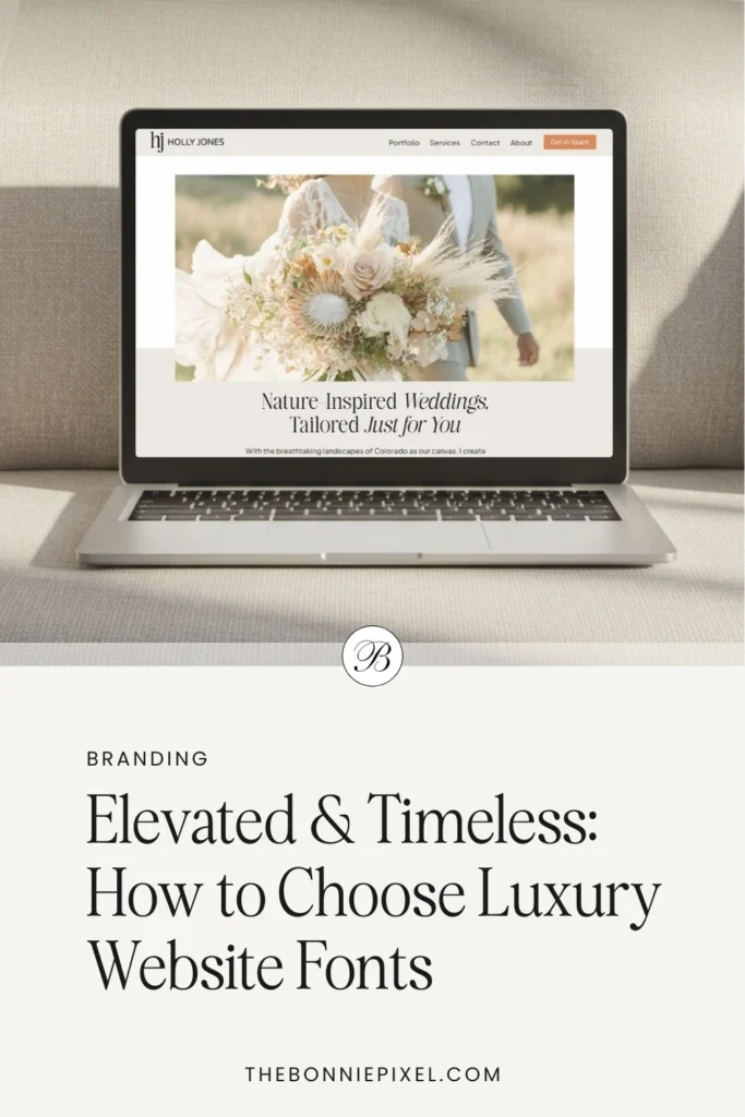
Your website is often the first place a couple begins to form an opinion about you, not just about what you offer, but about the kind of experience they can expect if they choose to work with you.
Before they read a single word, your typography is already doing the talking. The curves of your headlines, the spacing of your body text, and the weight of your lettering all quietly signal whether your brand feels considered, refined, and worth their investment or generic and easily overlooked.
If you want to attract a high-end clientele, choosing the right fonts is so much more than a design detail. It’s an essential part of how you position yourself as elevated, trustworthy, and timeless in a very crowded market.
Why typography matters for luxury branding in the wedding space
In a crowded market of wedding professionals, small details like typography can play their part in setting you apart. As one article on luxury typography says, “typography is often the unsung hero of branding.”
For luxury-oriented wedding professionals, your website needs to feel:
- Elevated — conveying sophistication, expertise, high standards
- Timeless — not tied to a fleeting trend, able to stand the test of time
- Cohesive — aligned with your overall brand (stationery, contracts, social)
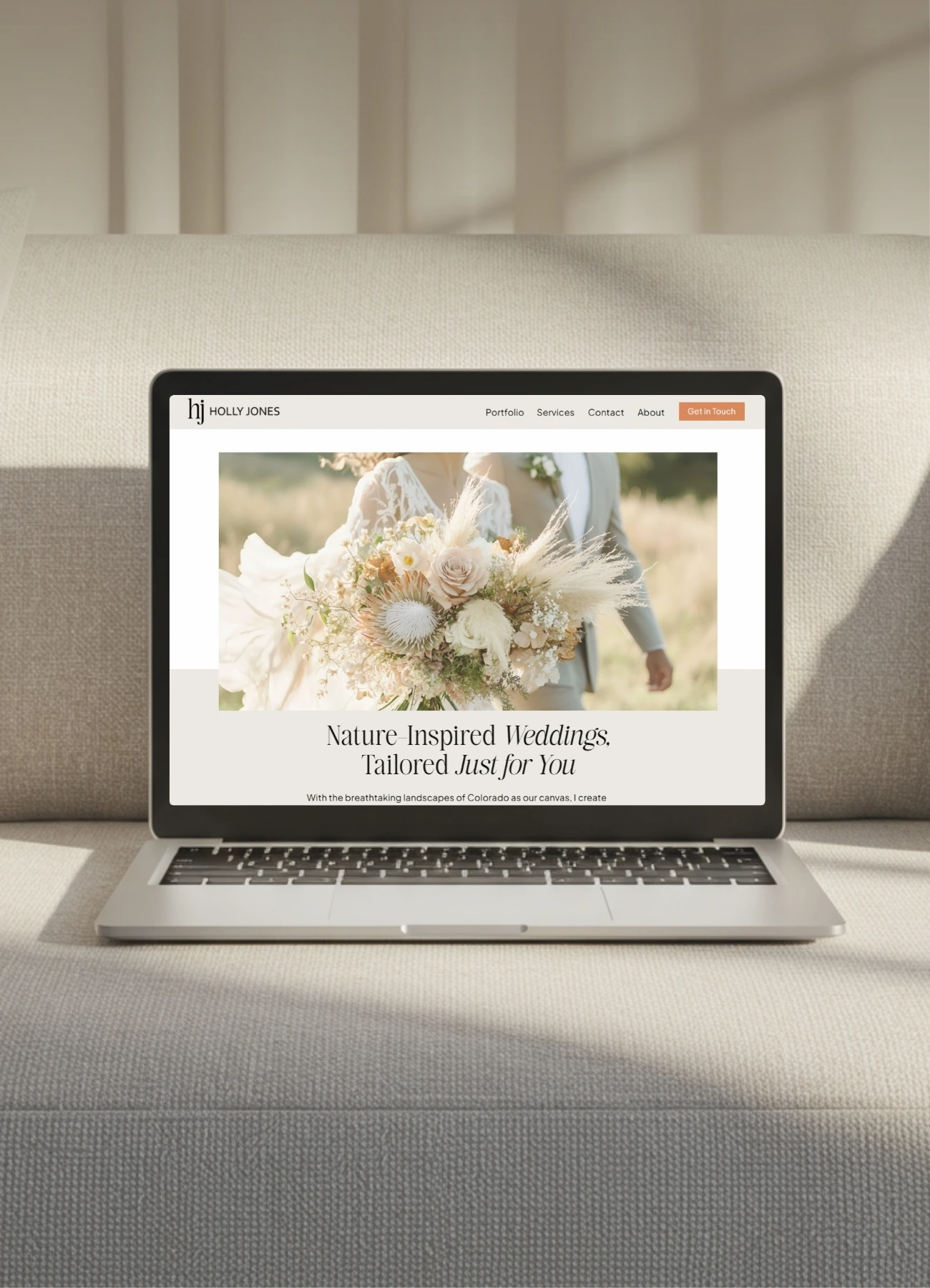
Your choice of fonts plays a direct role in each of these. For example, a fine serif with subtle contrast can hint at tradition and formality; a well-designed sans-serif with generous letter-spacing can feel modern yet refined.
In the wedding world, where feel and aesthetics are so important, the right fonts combined with beautiful images instantly set the tone when a potential client lands on your page.
Key characteristics of fonts that feel elevated and timeless
To identify truly elegant fonts for your luxury wedding website, look for these traits:
- Good contrast & quality of design
Luxury fonts often show refined details: high contrast between thick and thin strokes in serifs, elegant curves, generous spacing, and clear letterforms. - Readability & versatility across sizes
Even a gorgeous display font is no good if it becomes unreadable at the size you plan to use it. It is important to consider whether a font will be readable on the smaller screen of a mobile phone. - Subtlety: luxury without being fussy
True elegance often comes from simplicity. It’s not overly ornate. Look for classic, clean, balanced letterforms. - Cross-medium consistency
Your website font should feel at home in print materials as well as on your website. - Appropriate mood-setting
The font choice should resonate with the type of weddings you serve. If you target high-end, timeless weddings, then your fonts should reflect that: refined serifs, clean lines, minimal distractions. If your clientele is more casual or boho, adjust accordingly.
How to evaluate and select fonts for your luxury wedding website
Here’s a step-by-step process tailored for wedding professionals to choose your luxury website fonts:
Step 1: Define your brand look & feel
Before diving into fonts, revisit your brand mood:
- What words describe your brand? (e.g., refined, elegant, timeless, intimate, elevated)
- Who is your ideal client and what style of wedding do they most desire?
- What are your current brand colors, stationery style, and photography aesthetic?
Having clarity here will guide your typography choices.
Step 2: Gather font inspiration & shortlist
Look at the websites of other luxury wedding vendors, high-end stationery companies, and premium wedding venues. Notice what fonts feel refined and gather ideas.
From there, shortlist around 5-10 font families (or font pairings) that feel on-brand.
Step 3: Check license and versatility
Ensure your chosen font is available in web format for your website as well as standard format for any printed materials you may produce, such as client welcome packs. Also, ensure you have enough weights (e.g., regular, bold, italic) to give design flexibility.
If you’re thinking about using a paid font (recommended if you want to set your brand apart), look at the price of the various licenses you would need.
Step 3: Test behavior in use
Load your shortlisted fonts into staging pages and check:
- How the font performs at the various sizes you’re planning to use it at.
- Line-height, letter-spacing, and width of text blocks. Although this is something you can sometimes adjust, make sure you can create a version you’re happy with in the various platforms you use (web builder, Canva, email software, etc.).
- How the font appears on mobile (small screens). If a font looks stunning at a big size but becomes fuzzy or tight at a smaller size, it’s not the best choice.
- How combinations of characters work together. Try several titles and paragraphs from your existing content. Some fonts look great as individual letters, but when you see some letter combinations in words, not so much.
- Check punctuation too. Sometimes the font is pretty, but the ampersand or question mark not so much!
Step 4: Pair headline & body fonts thoughtfully
Typically, luxury websites use a more decorative or distinctive font for headlines (display), and a simpler, highly legible font for body text. For example: a refined serif for the site name and headings, paired with a clean sans-serif for paragraphs.
Step 6: Use your fonts consistently
Once you’ve selected your headline font, body font, and perhaps accent font (for quotes, testimonials), build a typography hierarchy and stick to it. Consistency fosters the “timeless” feel you want. Make sure your website, client management system, email templates, and social graphics all reflect the same fonts (or visually matching fonts).
Step 7: Document and future-proof
Create a simple typography style guide for your brand: specify the exact font names, weights, and sizes for different text elements (H1, H2, body, captions). This is helpful when you’re updating your site or creating new materials.
Practical pairing and usage tips (headlines, body text, accents)
Here are some recommendations and tips tailored for wedding-business websites:
Headline typography
- Use a high-contrast serif or an elegant display font: this gives that “luxury” feel.
- Set ample letter spacing (tracking) or slightly tighter line-height to enhance elegance.
- For text-based logo or site title, think of custom small caps or ligatures if your font supports them.
- Limit the use of script fonts in headlines. Scripts often feel personal, but overuse can reduce readability and appear trend-driven.
Body typography
There has been a tendency for high-end websites to use a paler-than-black, tiny font for paragraph text on websites.
Don’t fall into this trap.
Yes, it looks good, but it’s at the expense of legibility.
It’s no good having a great-looking web page if you need a magnifying glass to read it. Be sure to:
- Select a clean, easy-to-read font for paragraphs. Avoid display fonts here. Readability is key.
- Use a font with good legibility across all browser sizes and devices.
- Maintain consistent line-height (1.4–1.6 for web) and comfortable font size (e.g., 16px or more) to avoid your text looking cramped or illegible.
Accent typography (quotes, CTAs, testimonials)
Accent typography adds personality and emphasis without overwhelming the overall design.
This is typically used for quotes, testimonials, call-to-action text, or subtle brand moments where you want to draw the eye without disrupting the calm, considered rhythm of your website.
Rather than adding multiple extra fonts, the most elevated approach is usually to use a variation of your headline or body font — a lighter weight, a refined italic, or small caps — so everything still feels cohesive and intentional.
If you choose to bring in a script or handwritten font, keep it as a restrained accent rather than a primary player. Used sparingly, it can add warmth and personality, but overused, it quickly shifts from elegant to chaotic.
Your calls to action especially benefit from this restrained approach; they should feel confident and inviting, not shouty or overly decorative.
When your accent typography is carefully chosen and consistently applied, it subtly guides attention, reinforces your brand voice, and adds that polished, luxury finishing touch without stealing focus from the content itself.
Color, spacing & layout interplay
Color, spacing, and layout are what allow your typography to truly breathe and feel luxurious rather than cramped or cluttered.
Even the most beautiful fonts lose their elegance if they’re layered over busy backgrounds, squeezed into narrow columns, or paired with harsh, high-contrast colors.
A softer approach, like charcoal text on warm white, or muted tones drawn from your brand palette, instantly makes your type feel more refined and considered.
Generous spacing is equally important. Luxury design leans on white space and calm composition, allowing the eye to rest as it moves through your content instead of feeling rushed or overwhelmed. This kind of breathing room makes your website feel more like a beautifully designed editorial spread than a functional information dump.
When your color choices support legibility, your spacing feels intentional, and your layout respects the flow of your typography, your fonts can do their job properly and convey a quiet sense of quality that reflects the level of experience you offer your clients.
Common pitfalls to avoid
Even experienced professionals can fall into typographic traps. Here’s what to watch out for when selecting website fonts.
Pitfall: Choosing only on trend
If you select a font simply because it’s “in” right now, you risk your site feeling dated in a few years. Instead, focus on the timeless characteristics we discussed above.
Pitfall: Over-styling typography
Using too many font families, weights, or styles can make your site feel chaotic and reduce the premium feel. Stick to 1–2 fonts, one for headings and one for body (plus one accent if needed).
Pitfall: Poor readability for smaller screens
A beautiful script or high-contrast display font can look stunning on a large screen but be illegible on mobile. Always test across devices.
Pitfall: Ignoring web-licensing or load performance
High-end fonts often have licensing or file size implications. If a font loads slowly, or you embed too many weights, your website performance may suffer, and that undermines the premium experience of your website and brand.
Pitfall: Inconsistent typography
Your website typography should feel aligned with your print stationery, email templates, and other brand touchpoints. If your fonts are inconsistent, your brand may feel disjointed and unprofessional.
How to test, implement, and future-proof your font choices
Testing your font selection
- Create a simple landing page or homepage mock-up and apply your chosen fonts (headings, body, accents).
- View the mock-up on desktop, tablet, and mobile. Confirm readability, spacing, and mood.
- Ask a colleague or friend (preferably someone not design-trained) to look, scroll, and give feedback on how the fonts “feel”. Do they reflect luxury and elegance?
- Measure page load time. If font files are large or you load many weights, consider reducing or using more optimized formats (e.g., web-font subsets).
Implementation tips
- Use a reliable web-font service (e.g., Google Fonts, Adobe Fonts) or self-host if licensing allows.
- Define font-fallbacks in your CSS for browsers/devices that may not load custom fonts.
- Establish and document a typography scale: H1 size, H2 size, paragraph size, line-height, letter-spacing.
- Incorporate your typography decisions into your style guide so future pages or designers follow the same system.
Future-proofing your typography
- Choose fonts that have a good range of weights and styles (light, regular, bold, italic) so you’re not locked into a limited set.
- Avoid extremely decorative fonts; these tend to age faster.
- Revisit your website typography every 2-3 years to ensure it still aligns with your brand aesthetic and the expectations of your clientele. If things feel dated, instead of a full font overhaul, you may be able to refresh elements such as spacing.
- Train yourself (or your team) to treat typography as an integral part of brand maintenance, not just something you set and forget.
Application for wedding professionals
As a wedding professional (planner, photographer, stationery designer, venue stylist, etc.), you can leverage your choice of luxury website fonts to enhance your positioning and client experience:
- Brand perception: A refined website typography signals premium pricing and high-end service. Clients who see your site will subconsciously interpret your fonts as part of your brand promise.
- Cohesive client journey: If your website fonts match the fonts you use in your welcome packs, signage, PDFs, or invoices, you create a unified experience that feels thoughtful and elevated.
- Emotional resonance: Wedding clients are buying a feeling as much as a service. Elegant typography helps evoke that feeling of timelessness, romance, and trust.
- Differentiation: Many wedding vendor sites default to generic fonts or mismatched typography. By taking the extra step to select truly premium fonts, you stand out in the marketplace.
- Usability and conversion: Luxury typography does not mean sacrificing usability. In fact, readability and clarity support conversion so that clients are more likely to sign up, book, or contact you. A well-chosen font helps take them smoothly through your website.
Quick Checklist: Selecting your luxury website fonts
Here is a quick checklist to help ensure that you have chosen the fonts that best reflect your brand:
🗹 Define your brand mood and clientele for your website typography
🗹 Shortlist 5-10 fonts or font families that feel elevated and timeless
🗹 Test shortlisted fonts for readability, especially on mobile
🗹 Choose a pairing of headline + body fonts (plus accent if needed)
🗹 Check licensing and web-performance impact of the fonts
🗹 Create and document a typography style guide (sizes, weights, spacing)
🗹 Implement the fonts across your website and align them with other brand materials
🗹 Schedule a typography review every 2-3 years to maintain relevance
A strategic choice of fonts supports your brand, client experience, and business positioning. For wedding professionals aiming to deliver elevated, timeless services, typography can elevate your site from “nice” to “premium”.
When you follow a thoughtful process by defining your brand mood, selecting refined fonts, testing across devices, and implementing consistently, you create a website that embodies luxury and ease.
The beauty of typography is that it speaks silently yet strongly to your ideal clients. It whispers, “This is a premium experience. We care about the little details. We deliver quality.”
If you’re ready to elevate your wedding‐brand website with typography that truly aligns with a luxury client experience, I’d love to help.
Reach out to me at The Bonnie Pixel and let’s discuss how we can translate your vision into an elevated, beautiful, and functional website you’ll be proud to show off.

Jan Small is a web and graphic designer and owner of The Bonnie Pixel Design Co which offers all kinds of designs tailored for busy wedding professionals. Jan lives in Scotland with hubby and fur baby cockapoo Alfie and loves writing, yoga, and chocolate.
Leave a comment