As a wedding professional, your website serves as a 24/7 digital showroom and often forms your clients’ first impression. If it’s not optimized for mobile devices, you risk losing many potential clients.
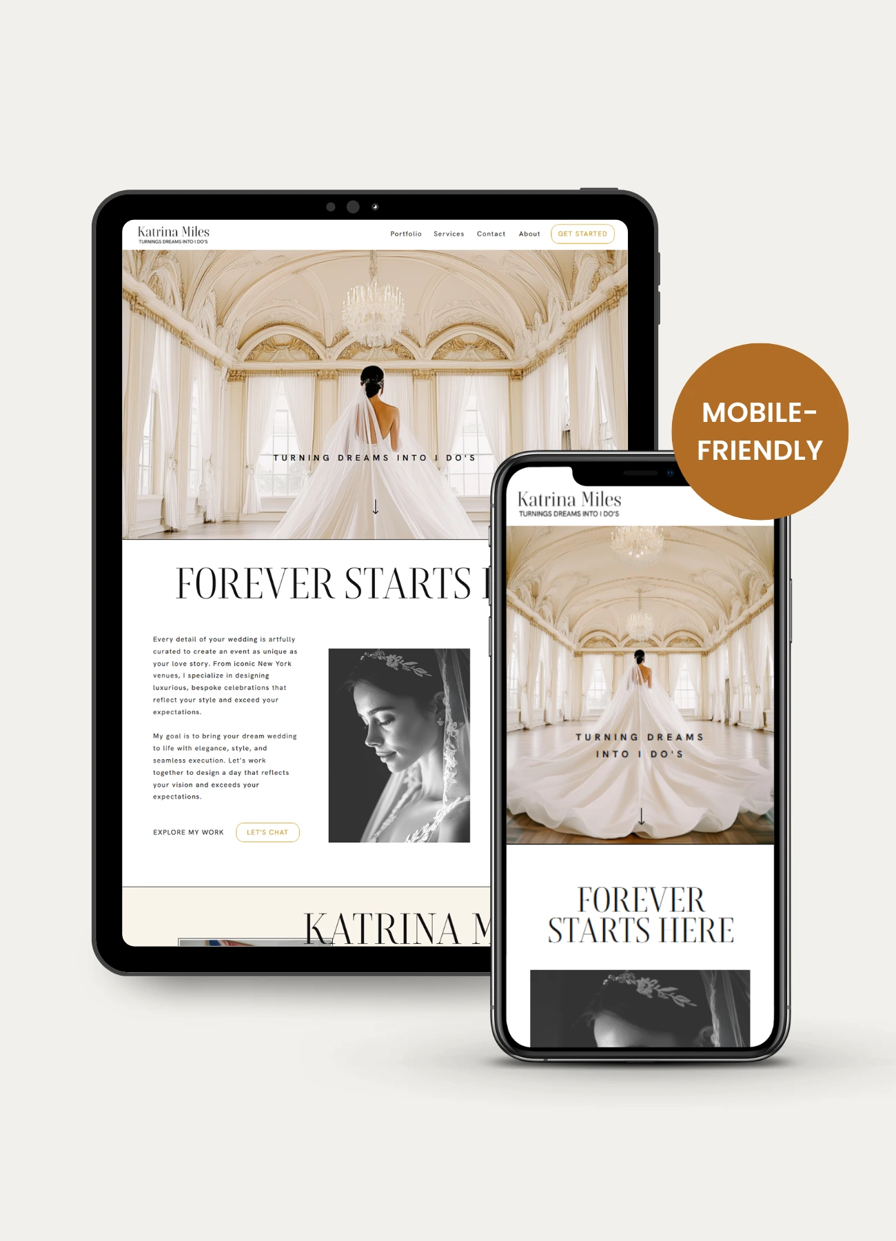
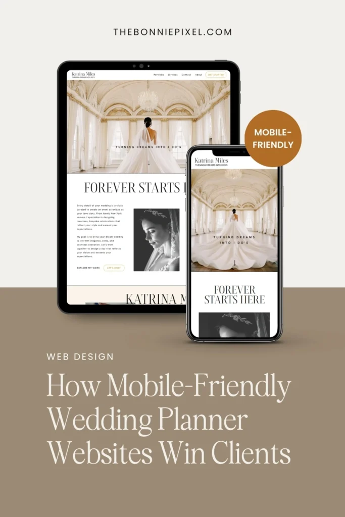
The shift to mobile-first browsing is no longer a trend; it’s the dominant reality of how modern couples plan their weddings. The key to winning more bookings is prioritizing a mobile-friendly website.
The Digital Realities of Modern Wedding Planning
The statistics are clear: the search for a wedding planner happens predominantly on a smartphone.
- Up to 80% of couples plan primarily on their mobile devices. They are scrolling through Instagram, saving ideas on Pinterest, and searching Google for local vendors while on the go—on their lunch break, commuting, or late at night.
- Over 60% of brides are actively planning their wedding and researching vendors using their phones.
- The vast majority of couples expect a seamless, digital experience. If your site doesn’t load instantly or looks broken on a phone, they won’t hesitate to move on to a competitor.
In this environment, simply having a website is not enough. You need a mobile-optimized website, a lightning-fast, beautifully responsive design that offers an effortless experience across all devices. This is the difference between capturing a qualified lead and watching a potential client bounce to the next planner in the search results.
Why a Non-Mobile-Friendly Website Loses You Clients
Imagine a potential high-end client, a busy professional, quickly searching for a destination wedding planner on her phone during a brief moment of downtime. She clicks your link, and what does she experience?
- Slow Loading Times: Heavy, unoptimized images cause the page to crawl. Every second counts. A slow-to-load website immediately creates frustration.
- Poor Readability: Tiny, unreadable text, small buttons, or images that spill off the side of the screen. She has to pinch, zoom, and struggle to find your contact page.
- Clunky Navigation: The menu is hidden, links are hard to tap, or the inquiry form requires endless scrolling to fill out.
This is not the luxurious, stress-free experience your planning service promises. A cumbersome, non-responsive design instantly communicates a lack of attention to detail and professionalism, which are fatal flaws in the wedding industry. They will back-click and find a competitor with a truly responsive website design.
The Non-Negotiable Elements of a Winning Mobile Site
To ensure your wedding planning business converts mobile visitors into booked clients, focus on these five core pillars of mobile-friendly websites:
1. Speed is Your First Impression
In the wedding industry, your portfolio is heavy with stunning, high-resolution photography. This visual appeal is crucial, but it can destroy your mobile load speed.
- Compress Images: Use image optimization tools to reduce file size without losing visual quality. This is the single biggest step you can take for a fast-loading website.
- Prioritize Above-the-Fold Content: Ensure your core message, a stunning hero image, and a clear Call-to-Action (CTA) are visible immediately without scrolling.
2. Intuitive Mobile Navigation
On a small screen, a complex desktop menu is overwhelming. Simplify your site structure.
- The “Hamburger” Menu: This three-line icon is the universally recognized symbol for the mobile menu. Ensure it’s easily accessible at the top corner.
- Concise Pages: Keep your primary pages brief and to the point: Home, Services/Packages, Portfolio, Testimonials, Contact.
- Easy-to-Tap Buttons: Ensure all clickable elements (links, buttons, and contact icons) are large enough for a thumb to press comfortably. This enhances user experience on your mobile-friendly website.
3. The Call-to-Action (CTA) Shortcut
Couples browsing on their phones are often looking for instant access to the next step. Eliminate friction in their journey.
- Floating Contact Buttons: Implement a sticky “Call Now” or “WhatsApp Us” button that stays visible as they scroll. This is a game-changer for instant lead generation.
- Simplified Forms: Make your inquiry form mobile-optimized. Ask for only the most essential details (Name, Email, Wedding Date/Year) to encourage completion. Longer forms can be reserved for the post-initial-contact phase.
4. Showcase Your Portfolio Effortlessly
Your portfolio is your main selling tool. It must shine on a phone screen.
- Optimized Image Galleries: Use mobile-friendly gallery formats that allow for easy swiping. Avoid heavy, old-school slideshows.
- Visual-First Storytelling: Let your images speak for themselves. The captions on a responsive website should be short, punchy, and highlight your unique value (e.g., “Boho Glam Destination Wedding in Tuscany”).
5. SEO & Mobile-First Indexing
Google has adopted “mobile-first indexing,” meaning it primarily uses the mobile version of your site for ranking and indexing. For wedding professionals, this means a non-mobile-friendly site will actively hurt your Search Engine Optimization (SEO).
The Competitive Edge: User Experience (UX)
Ultimately, investing in a robust, mobile-friendly website is an investment in your client’s first impression of your service.
The primary goal of great website design is to create a superb User Experience (UX). A great UX on a mobile device feels effortless, elegant, and reflects the high-quality, seamless service you provide as a wedding planner. When a couple has an easy, beautiful experience on your website, it builds instant trust and positions you as a professional who pays attention to every detail—large and small.
Don’t let an outdated, clunky site be the reason a potential client swipes away from your business. Make your mobile-friendly website your hardest-working salesperson and watch your client list grow.
The Real Advantage of a Mobile-Friendly Website
A beautifully mobile-friendly website doesn’t just “look good on a phone.” It communicates something far more important to your couples:
You care about their experience.
When your site loads instantly, feels effortless to use, and showcases your work with clarity and refinement, it mirrors the way you plan weddings. It’s calm, organised, detail-driven, and quietly luxurious.
Most wedding planners don’t lose inquiries because their services aren’t good enough.
They lose them because their website doesn’t reflect how good their services actually are.
But when your online presence finally matches the level of your client experience?
That’s when everything shifts:
- Browsing your site feels like the beginning of working with you
• Couples stay longer and look at more of your work
• They trust you faster
• Your inquiry rate rises naturally without shouting, discounting, or trying harder
A mobile-friendly, conversion-led website doesn’t just help you get found. It helps you get chosen.
Ready to Make Your Website Work as Beautifully as Your Weddings?
If your current website feels outdated, clunky, or “not quite you,” we can help.
The Bonnie Pixel Design Co specializes in designing timeless, elegant Showit websites exclusively for wedding professionals, the kind of sites that:
- feel luxurious on every device
- showcase your portfolio beautifully
- help couples understand your value instantly
- and guide them gently toward inquiring
If you want a website that finally reflects the level of your work and helps you book more of the right clients, we’d love to help.
View my bespoke web design services.
Or send me your website link here, and I’ll give you a quick, friendly, professional opinion on what’s working and what’s holding you back.

Jan Small is a web and graphic designer and owner of The Bonnie Pixel Design Co which offers all kinds of designs tailored for busy wedding professionals. Jan lives in Scotland with hubby and fur baby cockapoo Alfie and loves writing, yoga, and chocolate.
Leave a comment